Overview
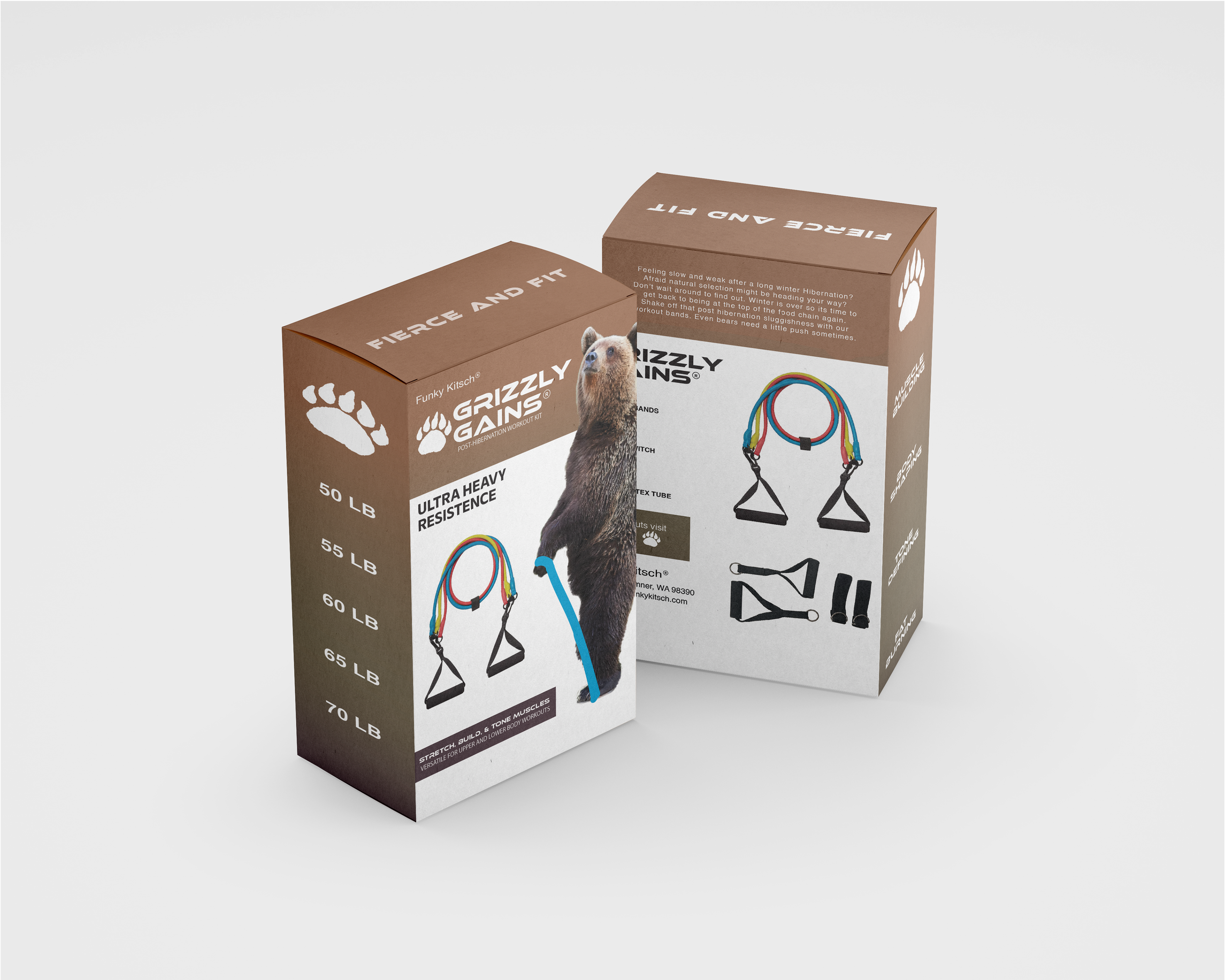
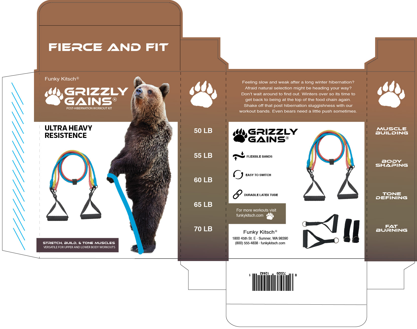
This project focused on designing packaging for Grizzly Gains, a playful and kitschy workout kit designed for bears emerging from hibernation. The goal was to create an eye-catching and humorous package that blends rugged strength with tongue-in-cheek branding, appealing to fitness enthusiasts who appreciate novelty and creativity in their gear. The final design reflects the product’s theme with bold visuals, engaging typography, and a strong outdoor-inspired aesthetic.
Objective
The primary objective was to create packaging that captures the humorous yet strong identity of Grizzly Gains, making it a standout product in both novelty and fitness markets. The design needed to balance humor with professionalism, ensuring it remained fun while effectively communicating the product’s purpose. The final package serves as a dynamic portfolio piece, showcasing skills in concept-driven design, branding, and visual storytelling.
Approach
The design plays heavily on the concept of post-hibernation fitness, using a fierce yet humorous visual of a bear gripping a resistance band. A rich, earthy color palette was chosen to reflect nature and strength, while bold, blocky typography enhances the rugged and powerful tone of the brand. The packaging structure allows for clear organization of product features, weight levels, and benefits, ensuring both functionality and visual impact. Playful copywriting reinforces the kitschy concept, engaging consumers with witty references to bears, hibernation, and the need to shake off seasonal sluggishness.