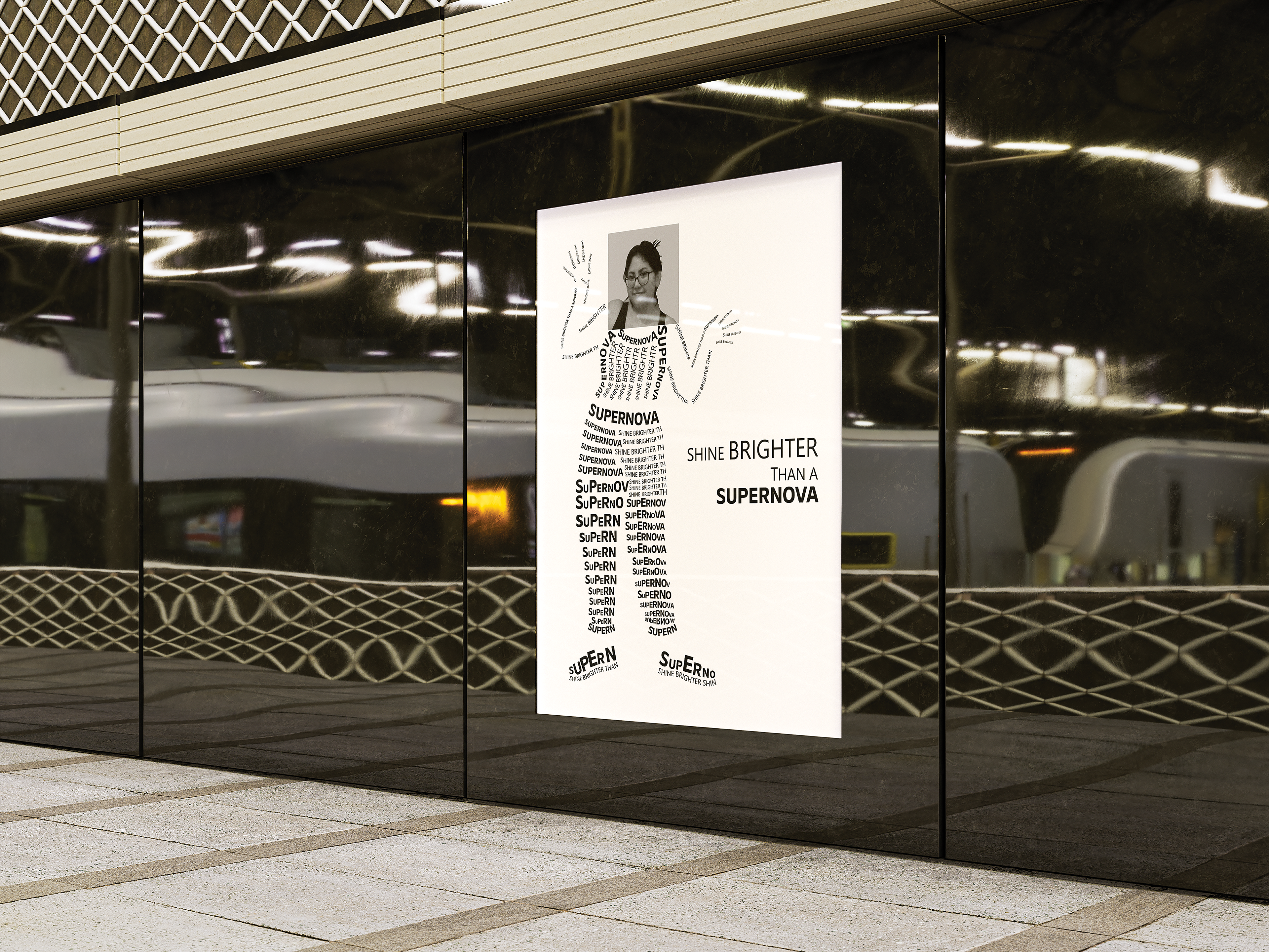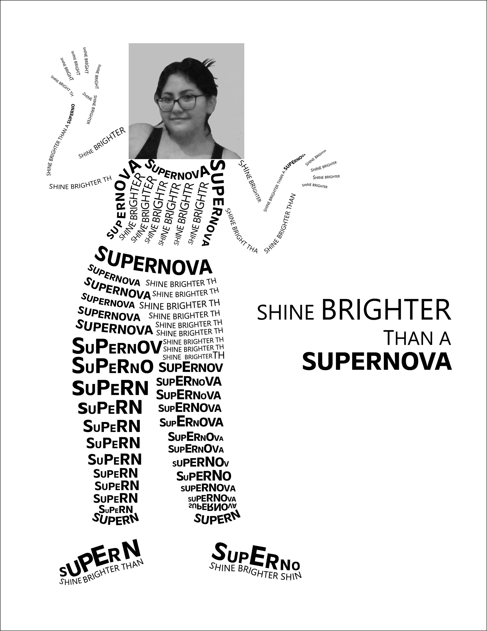
Overview
This piece was designed as a striking magazine feature or poster for Supernova Magazine, a publication dedicated to bold visual storytelling and typographic innovation. The composition merges portraiture with expressive text, using typography not just as a means of communication but as the very structure of the design. The message, “Shine Brighter Than a Supernova,” is reinforced through dynamic text placement, creating a compelling visual metaphor for confidence, individuality, and brilliance.
Objective
The goal of this project was to push the boundaries of typographic design by integrating text as both a structural and expressive element. Whether appearing in an editorial spread or as a poster promoting self-expression and creativity, this piece showcases the power of typography to shape meaning and emotion in a visually compelling way.
Approach
Typography takes center stage in this design, forming the silhouette of a human figure through carefully arranged words. The bold, uppercase text creates impact, while variations in size, orientation, and spacing introduce movement and rhythm. A monochromatic color scheme enhances contrast and readability, ensuring that the composition remains visually striking whether printed as a full-page magazine feature or a standalone poster.