Overview
This project involved designing a magazine spread for Rotating Pebble, a publication known for its bold storytelling and striking visuals. The goal was to create a layout that aligns with the magazine’s dynamic and contemporary aesthetic, ensuring readability while maintaining a strong visual impact. The final design reflects a polished and professional editorial style, capturing the essence of modern magazine publishing.
Objective
The primary objective was to develop a professional, publication-ready layout that reflects Rotating Pebble’s editorial identity. The project aimed to emphasize strong grid-based design, effective text flow management, and high-impact visual storytelling. The final result serves as a compelling portfolio piece, showcasing expertise in magazine design and editorial composition.
Approach
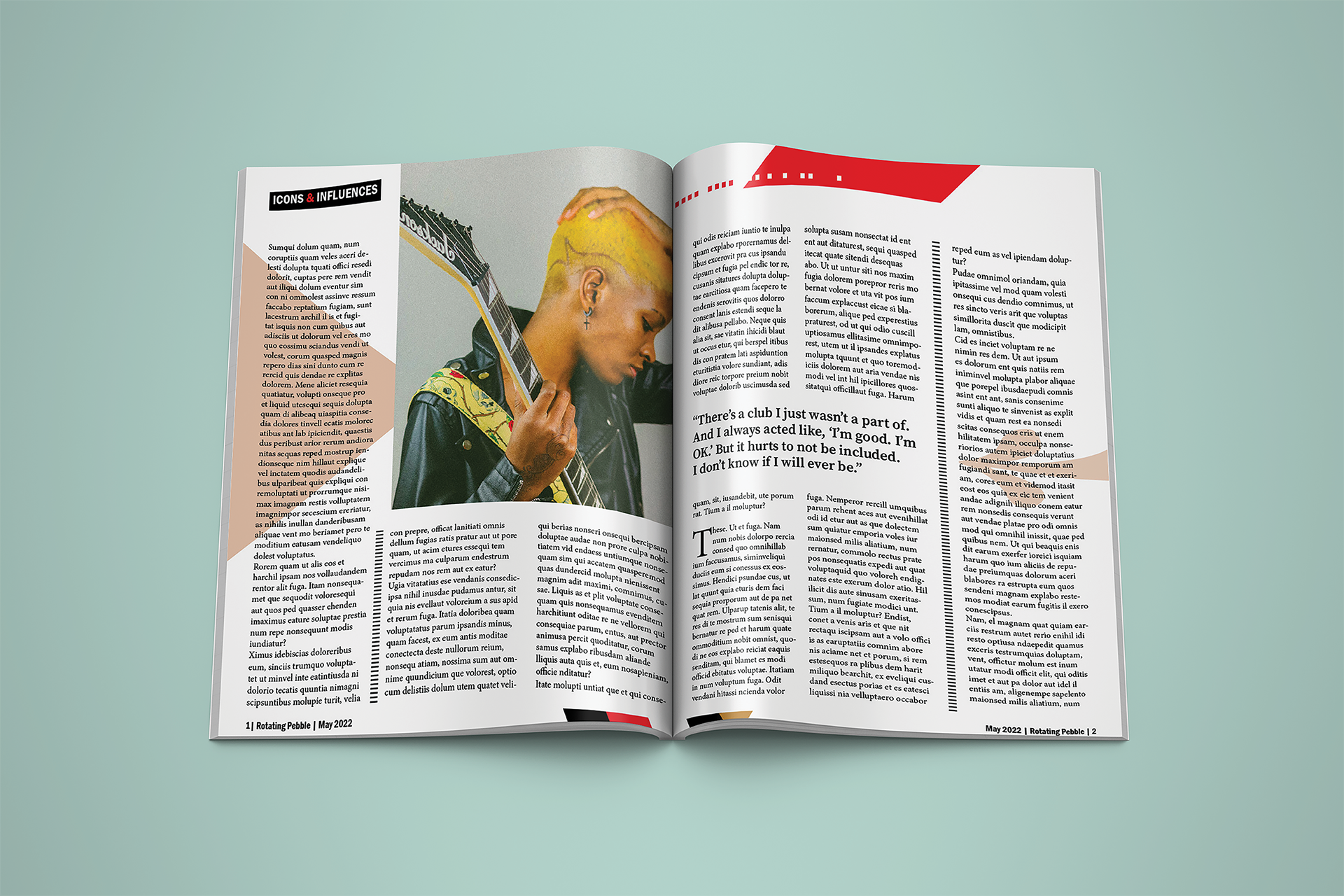
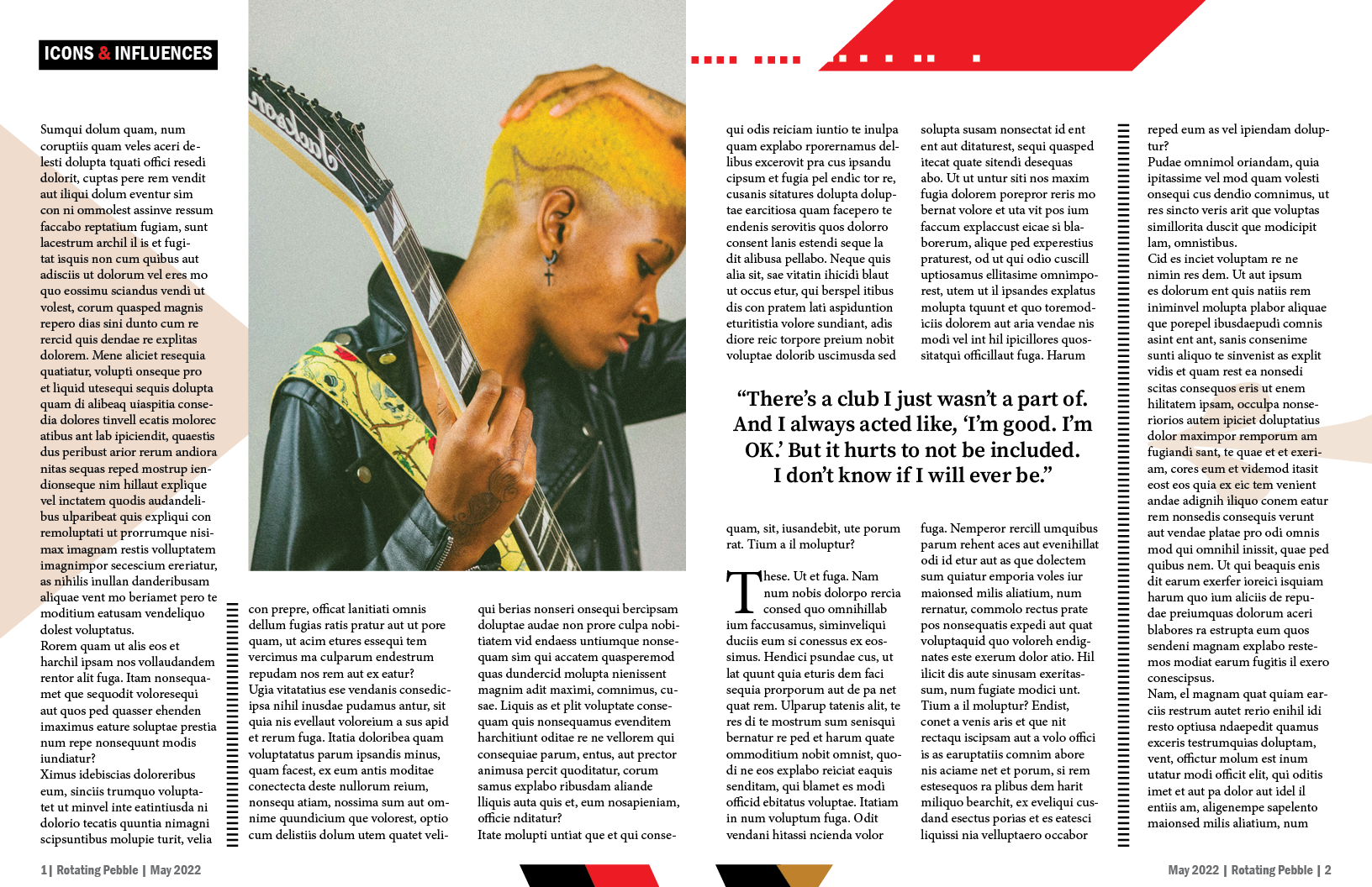
The design draws inspiration from Rotating Pebble’s signature style—bold headlines, striking photography, and a thoughtful mix of serif and sans-serif typography for contrast and hierarchy. A dominant portrait image establishes an immediate visual connection, while the text is arranged in structured, justified columns to create an authentic magazine feel. Strategic use of pull quotes and graphic elements, such as color accents and layout embellishments, enhances readability and adds depth to the spread. A red accent color was incorporated to align with the magazine’s recognizable branding while also drawing attention to key elements within the design.